Overview
How does your state compare when it comes to income per resident? This page features a live, interactive map of per capita personal income across all 50 U.S. states, based on continuously updated data from the U.S. Bureau of Economic Analysis (BEA) and the Federal Reserve Bank of St. Louis (FRED).
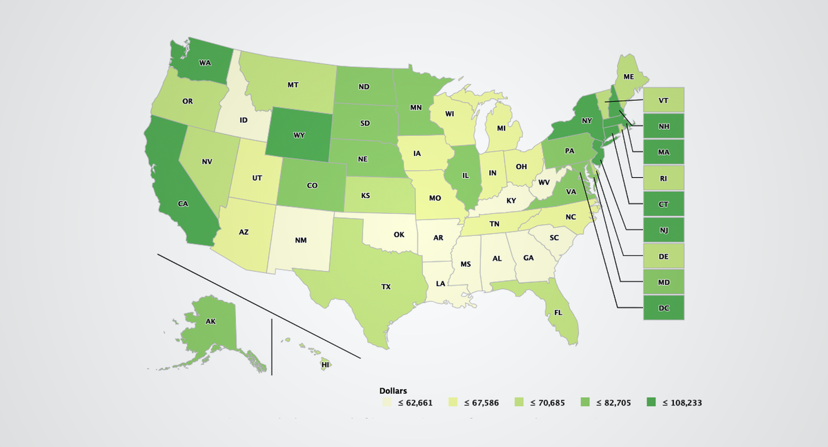
Use the map below to explore how income levels vary by state—and how your region stacks up nationally.
Compare All 50 States by Per Capita Personal Income
Per capita personal income measures the average income earned per person in a given state. A key tool for monitoring a wide range of economic trends, it includes wages, salaries, dividends, rent, and government benefits, offering a useful snapshot of economic activity and standard of living across regions.
The interactive map above displays the latest available data, with darker colors representing higher income tiers. You can hover or tap to view exact values for each state.
Understanding the Tiers
States are grouped into five income tiers, ranging from the lowest (below $67,500 per person) to the highest (over $108,000). These tiers help illustrate the persistent economic differences between regions, such as the concentration of high-income states in the Northeast and West Coast, and lower-income levels in parts of the South and Midwest.
This map updates automatically whenever new data is released, so it remains a reliable source for tracking income comparisons over time.
What to Do with This Data
Tracking per capita income by state can help contextualize national economic trends, cost-of-living differences, and policymaking decisions. Whether you're a student, researcher, policymaker, or curious resident, this tool provides a clear view of where each state stands in the broader economic landscape.
Learn More