
Tracking California Water Availability with USGS Streamflow Comparison Maps
This tool enables side-by-side visual analysis of two different time periods to identify spatial and temporal change in water availability. Users can contrast current monthly data against the previous year to see exactly how California’s water landscape has evolved.
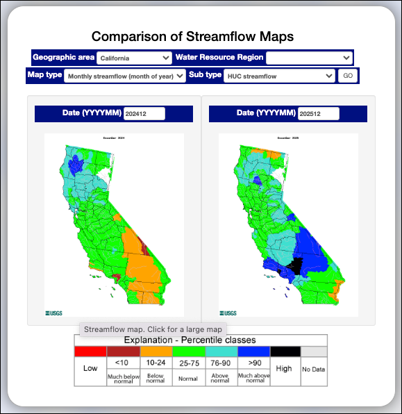
The USGS Comparison of Streamflow Maps tool allows users to view and contrast two different regional streamflow maps side-by-side to identify temporal or spatial trends.
Key Features and Functionality
- Side-by-Side Visualization: This utility displays two regional maps concurrently, facilitating direct visual contrast between different periods or metrics.
- Geographic Filtering: Users can select a specific Geographic area (such as California) or a broader Water Resource Region for comparison.
- Flexible Data Types:
- Map type: Users can choose the primary data category, such as "Monthly streamflow (month of year)".
- Sub type: Allows further refinement of the data view, such as "HUC streamflow".
- Temporal Customization: Two date input boxes (Date (YYYYMM)) allow users to specify the exact months and years to compare (e.g., comparing December 2024 to December 2025).
- Interactive Maps: Each map in the comparison view can be clicked to open a larger, more detailed version of that specific data.
Understanding the Comparison
The maps use a standardized color scale based on percentages to show how conditions shifted between two selected dates:
- Red: Low
- Dark Red (<10): Much below normal
- Orange (10–24): Below normal
- Green (25–75): Normal
- Light Blue (76–90): Above normal
- Dark Blue (>90): Much above normal
- Black: High
- Grey: No Data
By comparing the colors across the same geographic areas in both maps, users can quickly identify regions that have become wetter, drier, or remained stable over the selected timeframe.
Learn More About Tracking California Water Levels
Use the guides below to navigate the various tools and data visualizations provided by the USGS. These resources are designed to help you interpret real-time streamflow maps, historical runoff comparisons, and regional water conditions across California.
- USGS California Streamflow Map
- USGS California Comparison of Streamflow Maps
- USGS California Streamflow Summary
- USGS California Cumulative Runoff Hydrograph
- USGS California Duration Hydrograph
- USGS California Cumulative Percent Summary
- USGS California Regional Class Summary
- USGS California Area-Based Streamflow Map
- USGS California Streamflow Conditions Map