Tracking Water Distribution Shifts in CA with the USGS Cumulative Percent Summary
The USGS Percent Summary uses a stacked-area chart to show the exact proportion of California’s streamgages falling into specific flow categories. This visualization is critical for seeing how much of the state is currently experiencing "Normal" versus extreme conditions.
The USGS Cumulative Percent Summary (referred to as the Percent Summary on the official dashboard) provides a detailed look at the distribution of hydrological conditions across all participating streamgages in California over time.
Key Features and Functionality
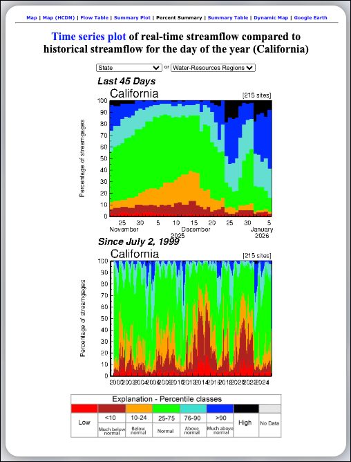
- Stacked Area Visualization: This tool uses stacked, color-coded areas to represent the percentage of streamgages falling into different percentile classes on any given day.
- Comprehensive Data: The plots are typically based on a large network of sites (e.g., 215 sites) to ensure a representative view of the state's water status.
- Dual Time Perspectives:
- Last 45 Days: This plot highlights recent shifts in conditions, showing how the proportion of sites in "Normal," "Above Normal," or "Below Normal" categories has changed over the past month and a half.
- Since July 2, 1999: This long-term plot provides historical context, allowing users to see how the current distribution of flow conditions compares to major wet and dry cycles over the last two decades.
- Navigation & Alternative Views: Links at the top of the page provide quick access to related data formats, including the Map, Flow Table, Summary Plot, Summary Table, and Dynamic Map.
Understanding the Percentage Chart
The vertical (y-axis) represents 0 to 100 percent of the streamgages. The relative thickness of each color band indicates what portion of the state is experiencing those specific conditions:
- Red: Low
- Dark Red (<10): Much below normal
- Orange (10–24): Below normal
- Green (25–75): Normal
- Light Blue (76–90): Above normal
- Dark Blue (>90): Much above normal
- Black: High
- Grey: No Data
For example, if the green band occupies the majority of the chart area for a specific date, it means most streamgages in the state were reporting "Normal" flow levels at that time.
Learn More About Tracking California Water Levels
Use the guides below to navigate the various tools and data visualizations provided by the USGS. These resources are designed to help you interpret real-time streamflow maps, historical runoff comparisons, and regional water conditions across California.
- USGS California Streamflow Map
- USGS California Comparison of Streamflow Maps
- USGS California Streamflow Summary
- USGS California Cumulative Runoff Hydrograph
- USGS California Duration Hydrograph
- USGS California Cumulative Percent Summary
- USGS California Regional Class Summary
- USGS California Area-Based Streamflow Map
- USGS California Streamflow Conditions Map