California's unemployment map updated with latest county data
Explore California’s latest unemployment rates and labor force trends using our interactive county-level map and job market charts. Updated monthly with new data from the EDD and U.S. Bureau of Labor Statistics.


California’s job market continues to shift month to month — with some counties recovering faster than others. The interactive tools below help visualize those changes in real time.
Use the interactive map to compare unemployment rates across the state, and view side-by-side tables that highlight how employment and labor force metrics have changed both month-over-month and year-over-year.
All data is sourced directly from the California Employment Development Department (EDD) and the U.S. Bureau of Labor Statistics (BLS) and is updated as soon as new information becomes available.
Unemployment Rate by County
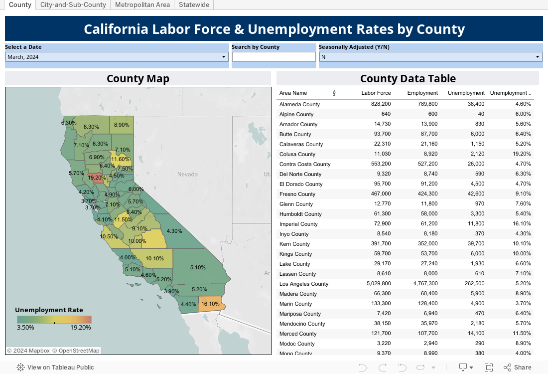
This interactive map lets you explore unemployment rates for each of California’s 58 counties. Use the toolbar or click on a county to view detailed figures. The map updates automatically with each new data release.
Labor Force Trends: Month-Over-Month and Year-Over-Year
Below, you’ll find two charts that break down California’s labor force numbers:
- One shows changes from the previous month.
- The other highlights shifts over the past year.
Metrics include:
- Civilian labor force size
- Employment and unemployment totals
- Unemployment rate comparisons between California and the U.S.
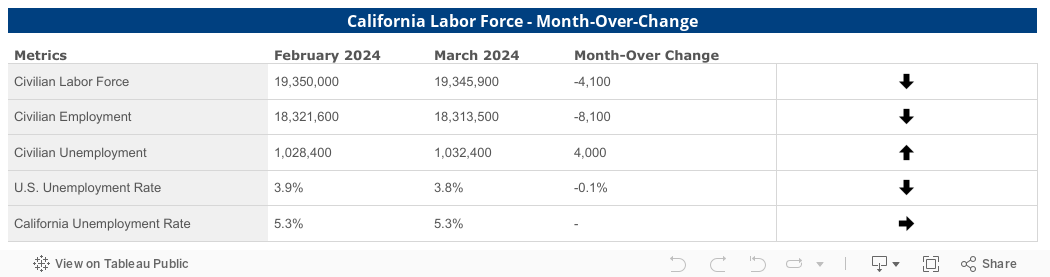
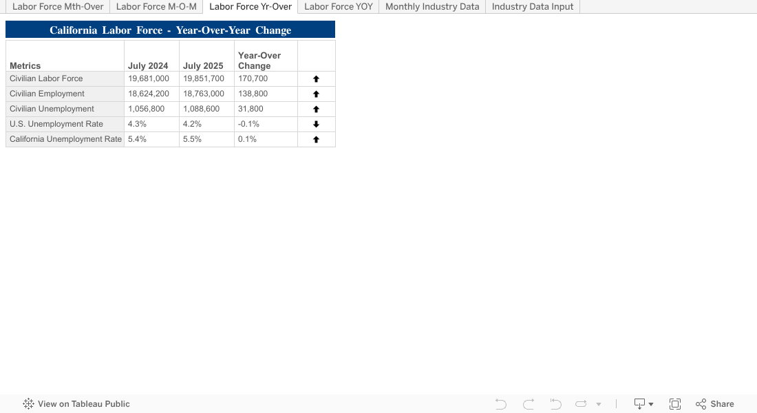
These tables give context to the county-level map, showing how broader statewide patterns are developing over time.
Conclusion
California’s labor landscape is in constant motion. With these interactive tools, you can stay informed about where job growth is happening, where challenges remain, and how your county compares to the rest of the state. Check back regularly to see the latest updates as they are released.


