
Comparing California Runoff Cycles using the USGS Duration Hydrograph Builder
The Duration Hydrograph Builder allows users to create custom time-period plots of area-based runoff. By overlaying current measurements onto historical percentile bands, the USGS provides a clear visual of how seasonal runoff patterns compare to typical historical norms.
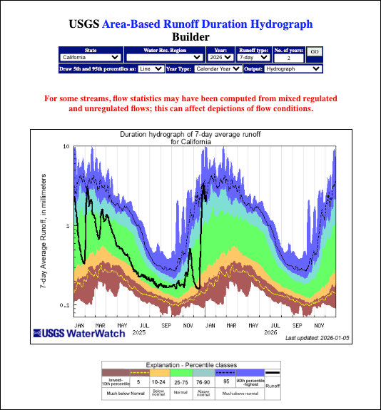
The USGS Duration Hydrograph (created using the USGS Area-Based Runoff Duration Hydrograph Builder) presents a history of runoff for a specific time period and area, such as California, compared against historical runoff percentiles.
Key Features and Functionality
- Customizable Timeframes: Users can select the specific Year to view and the Number of years (e.g., 2 years) to display on the hydrograph for comparison.
- Runoff Type Selection: The builder allows users to choose the type of runoff data to plot, such as 7-day average runoff.
- Flexible Year Types: The tool can generate plots based on either the Calendar Year or the Water Year.
- Advanced Plotting Options: Users can choose how to draw the 5th and 95th percentiles (e.g., as a Line) and select the desired Output format, such as a standard Hydrograph.
- Data Caveat: A warning note highlights that for some streams, flow statistics may be computed from mixed regulated and unregulated flows, which can affect the accuracy of the depicted conditions.
Understanding the Hydrograph
The hydrograph plots runoff depth (typically in millimeters) on the vertical y-axis against time on the horizontal x-axis.
- Runoff (Black Line): The solid black line represents the actual measured runoff over the selected period.
- Historical Context (Color Bands): The background is color-coded into percentile classes based on historical data to show how current runoff compares to past norms:
- Purple/Blue (90th percentile - highest): Much above normal.
- Light Blue (76–90): Above normal.
- Green (25–75): Normal.
- Yellow/Orange (10–24): Below normal.
- Brown/Dark Red (lowest - 10th percentile): Much below normal.
- Specific Percentile Lines: Dashed lines frequently indicate the 5th (near the bottom) and 95th (near the top) percentiles for additional statistical context.
Learn More About Tracking California Water Levels
Use the guides below to navigate the various tools and data visualizations provided by the USGS. These resources are designed to help you interpret real-time streamflow maps, historical runoff comparisons, and regional water conditions across California.
- USGS California Streamflow Map
- USGS California Comparison of Streamflow Maps
- USGS California Streamflow Summary
- USGS California Cumulative Runoff Hydrograph
- USGS California Duration Hydrograph
- USGS California Cumulative Percent Summary
- USGS California Regional Class Summary
- USGS California Area-Based Streamflow Map
- USGS California Streamflow Conditions Map