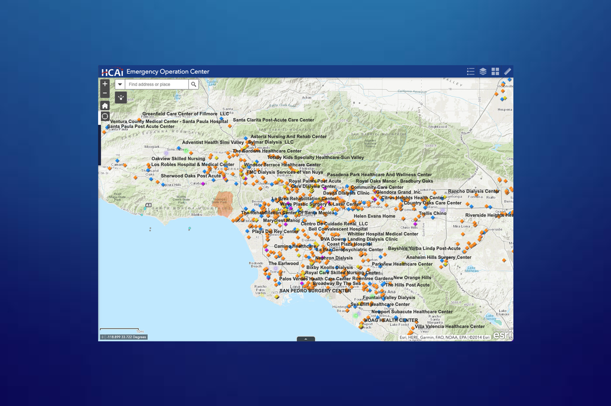
This tool within the CHHS Program Dashboard allows users to explore interactive maps showing participation in public assistance programs across California. Developed by the California Health & Human Services Agency (CHHS), the County & District Maps dashboard lets users compare total enrollment numbers by geography and program type, with color-coded heatmaps that highlight regional differences at a glance.
Whether you're looking to understand where CalFresh is most utilized or which counties see the highest Medi-Cal enrollment, this tool provides a geospatial lens into California's safety net.
Key Features of This Tool
- Interactive Heat Maps:
Visualize participation totals with gradient shading from light to dark, indicating low-to-high enrollment values. - Program-Specific Views:
Use the dropdown menu to toggle between CalWORKs, Medi-Cal, WIC, CalFresh, Foster Care, IHSS, and other state-administered services. - Geographic Filters:
Switch between County and Legislative Districts (Assembly, Senate, Congress) to zoom in on your region of interest. - Time Range Selection:
Choose from available dates (such as July 2020) to assess how participation changes over time. - Data Masking for Privacy:
Any county or district with 10 or fewer participants is marked as “null” to protect individual identities and ensure data privacy. - Hover Definitions:
Definitions and program descriptions are accessible directly in the tool for added context.
Learn More
This mapping tool brings the scale and distribution of California’s public assistance programs into sharp focus. Ideal for researchers, journalists, and public officials, it supports evidence-based policy by showing where needs are highest—and where additional outreach may be required.
Explore the map, change the filters, and discover what public program usage looks like across every corner of the state.
Explore Other Tools in the CHHS Program Dashboard:
- Single Program Participation and Demographics
- General Population Characteristics
- County/District Program Profiles
- Co-Enrollment in More than One Program
If you would like to see more tools like this, review the interactive maps, datasets, and dashboards below.


