How to track California water levels and flood risk with USGS data: Complete guide for 2026
Master the tools used by state officials to monitor California river levels. This 2026 guide explains how to interpret USGS WaterWatch data, including streamflow status and flood monitoring alerts, to help you understand the hydrological impact of recent atmospheric rivers.


As 2026 begins, California is experiencing a major shift in its water conditions. A succession of strong winter storms swept across the state from late December through the New Year, dramatically increasing rainfall and replenishing water supplies. These storms delivered widespread, sustained precipitation, making this one of the wettest holiday periods California has seen in many years.
The heavy rainfall largely erased drought concerns statewide, but the rapid transition from dry to wet conditions brings new challenges. Flooding is an immediate concern in several regions, a state of affairs that could become the new normal, at least in the near future.
In this environment of saturated watersheds and rising river levels, moving from general news reports to precise data is vital for public safety and resource management. The USGS WaterWatch State Dashboard serves as the authoritative source for this information, providing the same real-time insights used by state water managers to make critical flood protection decisions. Our guide serves as a manual for navigating the dashboard's nine primary tools to track streamflow, runoff, and historical comparisons during this high-stakes 2026 water year.
Real-Time Status: The Mapping Suite
The most immediate way to assess how California's waterways are responding to recent atmospheric rivers is through the dashboard's mapping tools. These visualizations allow you to differentiate between localized "flash" incidents and broader regional trends across the state’s diverse watersheds.
Localized Monitoring: The Streamflow Conditions Map
The Streamflow Conditions Map is designed for high-resolution, point-specific tracking. It is a critical resource during active storm events, as it identifies which specific rivers or creeks are reaching peak flow levels that may pose a threat to local infrastructure. While the official USGS map provides the raw data, understanding how to filter for "peak flow" is essential for isolating the most urgent areas of concern.
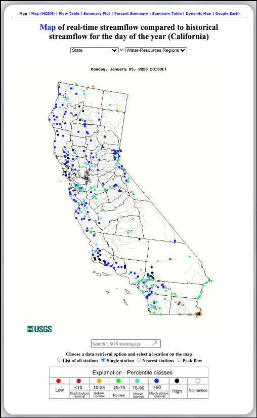
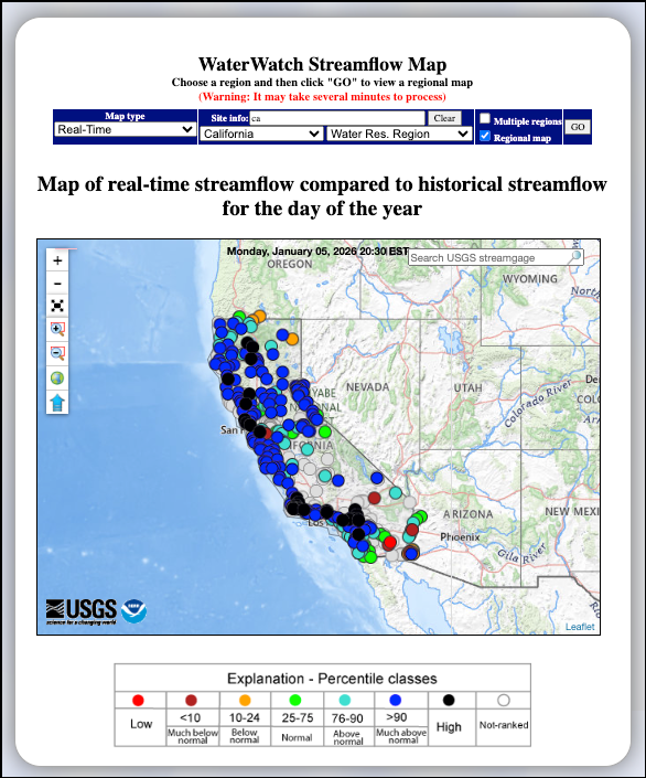
Interactive Navigation: The State Map
The Interactive State Map serves as the primary portal for navigating California's vast hydrological network. This tool allows you to visually explore the state and click directly on individual color-coded gauging stations to access detailed, site-specific data pages. If you are looking to bookmark the gauge nearest your home for quick reference during the rainy season, this is the viewer to use.
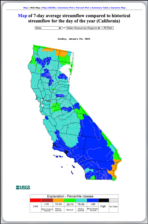
Watershed Health: The Area-Based (HUC) Map
While point data focuses on specific locations, the Area-Based Streamflow Map provides a broader perspective on regional watershed health. By averaging flow across Hydrologic Unit Codes (HUCs), this tool highlights the overall status of entire drainage basins. This visualization is particularly useful for understanding how widespread precipitation—such as the record-breaking holiday storms—impacts the cumulative flow of an entire region rather than just a single river point.
Tracking Statewide Trends & Averages
To understand the broader impact of the record-breaking 2025 holiday storms, the USGS provides high-level visualizations that summarize water conditions across the entire state. These tools move beyond individual river points to show the "pulse" of California’s hydrology.
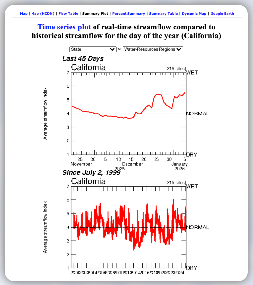
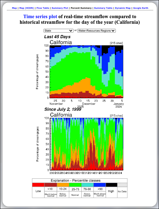
Analyzing the National Average: The Streamflow Summary
The Streamflow Summary provides a high-level visual summary of how current streamflow conditions compare to the historical record. By plotting the Average Streamflow Index—a collective measure from approximately 215 sites—against a 30-year baseline, it clearly illustrates major wet and dry cycles. This is the definitive tool for seeing how the recent atmospheric rivers shifted the state from a "Dry" to "Wet" index, and you can view the live Time Series Plot to see if that trend is holding steady.
Visualizing Distribution: The Cumulative Percent Summary
While an average is helpful, the Cumulative Percent Summary offers a more granular view by showing the distribution of conditions. This stacked area chart displays what percentage of the state's streamgages are reporting specific percentile classes, such as "Above Normal" or "High." In early January 2026, these charts help visualize exactly how much of the state’s hydrological network has been impacted by extreme precipitation compared to the official live plot.
Precise Data: The Regional Class Summary Table
For users who require exact numbers rather than charts, the Regional Class Summary Table provides a tabular breakdown of current streamgage status. It lists the percentage of stations falling into each of the seven percentile classes for every day, providing a detailed count of the state's water status from "Low" to "High." You can toggle the dates on the USGS Summary Table to track how quickly flood conditions recede after a storm.
Historical Context & Runoff Tracking
Runoff is a critical metric for long-term water management. Unlike streamflow, which measures the rate of water passing a specific point at a specific moment, runoff tracking measures the total volume of water leaving the land surface. This distinction is vital for understanding whether winter storms are actually replenishing the state's long-term water deficit or simply washing away.
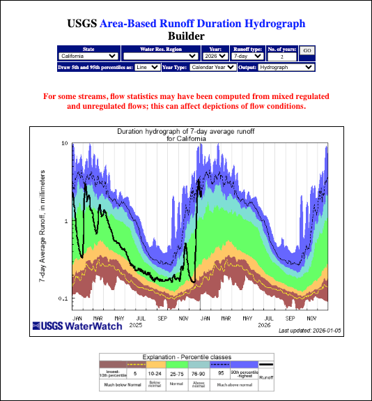
Contextualizing Current Flows: The Duration Hydrograph
The Duration Hydrograph allows you to overlay current runoff measurements onto historical percentile bands. By plotting the 7-day average runoff against historical norms, this tool reveals if recent peaks (shown as a solid black line) are behaving normally or entering extreme territory. Use the official builder tool to toggle between different timeframes and see how the current storm cycle ranks against decades of data.
Tracking the Water Year: Cumulative Runoff
The Cumulative Runoff Hydrograph is essential for tracking the total accumulation of water since the start of the Water Year (October 1st). It compares the current year's total volume against two critical historical benchmarks: the record-dry year of 1977 and the record-wet year of 1983. Following the heavy precipitation of late 2025 and early 2026, checking the live hydrograph is the best way to see if the state is tracking towards a surplus or deficit season.

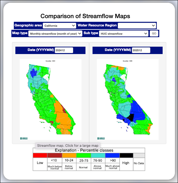
Visualizing Change: Comparison of Streamflow Maps
Finally, the Comparison of Streamflow Maps tool is perfect for visualizing year-over-year or month-over-month changes. This tool lets you place two different regional maps side-by-side, allowing for a direct contrast between the current saturated landscape and previous dry periods. You can configure your own comparison dates using the USGS Comparison Tool to identify exactly where the most significant hydrological shifts have occurred.
Practical Applications
Knowing which tool to use depends entirely on your immediate goal. The dashboard serves two very different functions: immediate safety monitoring during storms and long-term resource tracking during dry spells.
For Flood Monitoring & Safety
During atmospheric river events—such as the "relentless" systems we saw in early January—your primary tools should be the Streamflow Conditions Map and the Regional Class Summary.
- Action: Check the map for black and dark blue dots, which indicate "High" or "Much Above Normal" flow.
- Validation: Use the summary table to see if the percentage of stations in the 90th percentile is rising or falling day-over-day. This confirms whether the flood threat is peaking or receding state-wide.
For Water Supply & Drought Tracking
When the rain stops and the focus shifts to reservoir health and water supply, turn to the Cumulative Runoff Hydrograph.
- Action: Monitor the solid black line relative to the green "Normal" band.
- Insight: Even after a wet month, if the black line dips below the green band later in the season, it indicates that the total volume of captured water is lagging behind historical norms, potentially signaling a return to deficit conditions.
For Recreation
Before heading out for fishing, kayaking, or swimming, always check the Interactive State Map.
- Action: Locate the specific gauge nearest your destination.
- Safety: Never rely on visual estimates alone. A river may look calm but can be moving at dangerous volumes (discharge) or have risen significantly in stage height since your last visit.
Moving From Data to Action
Navigating California's complex water system requires a move beyond simple weather forecasts. By using the USGS WaterWatch State Dashboard, you can access the same real-time data used by state water managers to make critical flood control and storage decisions.
The record-breaking storms of early 2026 have set a saturated stage for the months ahead. Whether you are monitoring the impact of the next atmospheric river or tracking the long-term progress of the Water Year, these nine tools provide the definitive, historical context that news headlines alone cannot match. Bookmark these pages, learn the baselines, and stay informed.


